folium map with a reverse-teardrop shaped folium.Marker() indicating the location of Tokyo.
folium.CircleMarker()folium.CircleMarker() object to generate simple scatter plot like maps, complete with hover over and pop up text. Complete code is available in the GitHub repository.
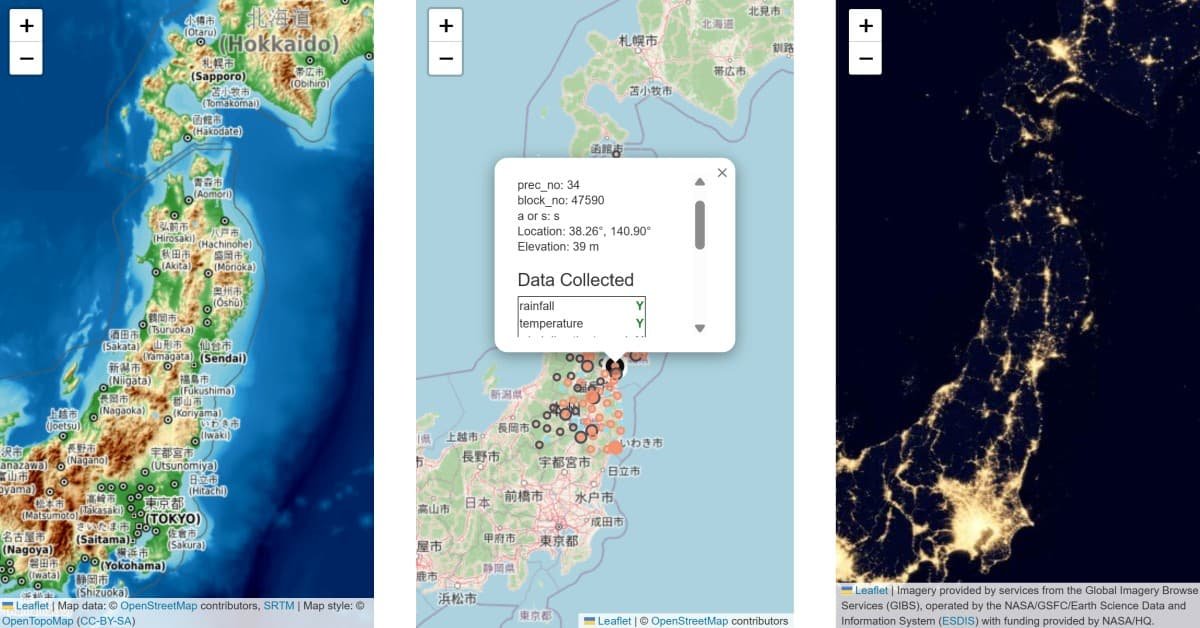
folium’s CircleMarker method.Drawing beautiful maps with Python is easy with the folium library. Locations with known latitude and longitude coordinates can be marked with the reverse-teardrop pointer, with the library taking care of the base map.
folium map with a reverse-teardrop shaped folium.Marker() indicating the location of Tokyo.
The folium.Marker() marker, aesthetically similar to markers using in popular map apps, is nice when you have a couple locations to mark. However, when marking close to a hundred locations on the folium map, the reverse-teardrop shaped marker can overcrowd the map making it difficult to decipher. Once you’re nearing a thousand markers, chances are, your folium map will not render due to lack of memory.
One possible solution is to use the folium.CircleMarker() object, which is much lighter than the folium.Marker() object.
This blog post shows you how to use the folium.CircleMarker() object to generate simple scatter plot-like markers on folium maps. We’ll cover how to change the marker’s color and opacity, add mouse-over text which appears when the cursor hovers over the marker, and install pop up text that appears when the user clicks on the marker. Map legends for circle markers are covered in another blog post.
By the end of this tutorial, you’ll learn how to:
folium.CircleMarker() and modify the marker’s
If you prefer to skip the explanations and jump straight to the implementation, you can download the code from my GitHub repository.
Here is the list of things you’ll need to run the code.
folium-map-scatter-plot.ipynb Jupyter notebook or folium-map-scatter-plot.py Python script from my GitHub repositorydata/ subfolderpandasfoliumbase64IPython.displaydotenvosPop up: The small graphical user interface that appears when the user clicks on a screen element.
Tooltip: The small graphical user interface that appears when the cursor hovers over a screen element. Depending on the coding language used, it may be called hover over text or mouse-over text.
folium Maps in Your IDEBefore drawing folium maps, I’d like to address a relatively common issue seen in (at least) VS Code. Namely, the maps may not render in the Jupyter notebook cell due to “trust issues” between the file and the folium library (Figure 2). Depending on the IDE you use, you may also run into this issue.

folium and VS Code.
Many of the solutions I’ve tried seem to be inconsistent. The issue resurfaces after a few runs.
For me, the one solution that worked consistently was to make a function that embeds the folium map into an IFrame. To display the map, you simply call the function within the Jupyter notebook.
The only downside to this solution is that we’ll need the base64 and IPython.display libraries for the function to run smoothly.
# Libraries needed to embed the folium map into an IFrame using base64 encoding
import base64
from IPython.display import IFrame, display
Please note that I did not write this function. It comes straight from the GitHub discussions.
def show_folium_safe(m, height=500):
    """
    Displays a Folium map in a safe IFrame using Base64 encoding.
    This avoids "Trusted" errors, file path issues, and CSS leakage.
    Source: https://github.com/microsoft/vscode-jupyter/issues/17224#issuecomment-3679624559
    """
    # 1. Get the raw HTML string of the map
    html_content = m.get_root().render()

    # 2. Encode the HTML to base64
    # This allows us to put the entire map "inside" the URL string
    encoded = base64.b64encode(html_content.encode('utf-8')).decode('utf-8')

    # 3. Create a Data URI
    data_uri = f"data:text/html;charset=utf-8;base64,{encoded}"

    # 4. Display the IFrame
    # We use width='100%' to fill the cell width, but the CSS is trapped inside
    display(IFrame(src=data_uri, width="100%", height=height))
So now, instead of calling m to display the map, we call show_folium_safe(m) instead.
Now, back to drawing scatter plots on maps.
folium MapsThe most basic of folium maps can be drawn by creating a folium.Map() object. Let’s import the folium library and draw out a basic map with the opentopomap map tile design.
# Import folium library
import folium
# Make a generic folium map
m = folium.Map(
tiles='opentopomap'
)
# Show the map
# m # If IDE does not render map use line below
show_folium_safe(m)folium.Map() with no parameters creates a generic map of the world.
Rarely do we want such a vague and generic map. To make the map more informative, I suggest we start with three parameters when calling folium.Map().
locationtileszoom_startThe location parameter specifies the latitude and longitude of the center of the map. The tiles parameter dictates the map style and the basic information to be drawn on the map. The starting zoom level can be assigned using the zoom_start parameter.
The default map tile is openstreetmap, but there are other map styles. Here’s what opentopomap style from before looks like centered on the Sendai region in Japan with a starting zoom value of 10:
# Generate a folium map
sendai_lat_long = (38.268, 140.869)
m = folium.Map(location=sendai_lat_long,
               tiles='opentopomap',
               zoom_start=10,
               min_zoom=9,
               max_zoom=11,
               prefer_canvas=True)

# Show the map
show_folium_safe(m)opentopomap tile at starting zoom level of 10.
You can see the major roads, lakes and rivers, cities and towns and prefectural boundaries.
Here’s the same map with a lower starting zoom level of 5:
# Generate a folium map
m = folium.Map(location=sendai_lat_long,
               tiles='opentopomap',
               zoom_start=5,
               min_zoom=4,
               max_zoom=6,
               prefer_canvas=True)

# Show the map
show_folium_safe(m)opentopomap tile at starting zoom level of 5.
A lower zoom level means we have zoomed out. As such, Figure 5 is moreso a map of Japan, than it is a map of the Sendai region in Japan.
You may have noticed that the map zooms in and out quite a bit in Figure 3. If this feature is too much, you can specify min_zoom and max_zoom parameters, as I have done in Figure 4 and Figure 5. This prevents the map from zooming out or in past a certain limit. I’ve also included the prefer_canvas parameter, which is a backend setting that helps with the plotting of a large number of circle markers, which we will be doing in later sections.
For the tiles option, folium can use any map tile available from the xyzservices package, a lightweight library of raster basemap tiles. You can preview map styles available from xyzservices here.
Note that some map tiles require separate registration. Additionally, depending on your intended use case for your maps, you may need to be well versed in each of the map data licenses. I’ll cover a couple of the map tile licenses below.
When using Python libraries heavy with backend data, it is important to know whether you are allowed to copy, modify, share or even commercialize from the data or code. Here, I list the licenses involved in some of the map tiles that power folium maps. If you use a map tile not in this list, be sure to check their license.
folium and leaflet LicensesFirst of all, folium and its underlying leaflet library are the software associated with creating the interactive maps. As of August 2026, folium has a permissive license which allows for great freedom.
Permission is hereby granted, free of charge, to any person obtaining a copy of this software and associated documentation files (the “Software”), to deal in the Software without restriction, including without limitation the rights to use, copy, modify, merge, publish, distribute, sublicense, and/or sell copies of the Software, and to permit persons to whom the Software is furnished to do so, subject to the following conditions:
The above copyright notice and this permission notice shall be included in all copies or substantial portions of the Software.
Similarly, leaftlet is licensed under the BSD-2 clause license, allowing people to use their code even for commercial purposes.
While the folium library visualizes the map, it does not own the data used to draw the maps. The license for usage of the maps depends on the entity that owns the map data, and different entities own the different folium map tiles. Additionally, some map tiles require registration, which is a whole different process of its own.
Here, I list some of the easily accessible map tile options which can be previewed here, draw out what they look like, and provide a brief explanation of their license.
The OpenStreetMap data’s license is, as the name implies, open.
You are free to copy, distribute, transmit and adapt our data, as long as you credit OpenStreetMap and its contributors.
This includes commercial use.
However, you are required to credit OpenStreetMap when using their data. Luckily, when you draw the maps using folium, they take care of this by placing a small attrition to OpenStreetMap in the lower right corner of the interactive maps.
Figure 6 shows an example of the OpenStreetMap map tile. Take note of the credits in the lower right corner.
# Generate a folium map
m = folium.Map(location=sendai_lat_long,
               tiles='openstreetmap',
               zoom_start=7)

# Show the map
show_folium_safe(m)openstreetmap tile at starting zoom level of 7.
One other thing to keep in mind is if you decide to build upon their data. Your end result must also be distributed under the same open license.
If you alter or build upon our data, you may distribute the result only under the same license.
On the other hand, the three basic CartoDB map options ('cartodb positron', 'cartodb darkmatter' and 'cartodb voyager') have some restrictions on their usage. For one, you will need an API key to use their map tiles. Additionally, if you are thinking of commercializing based on the CartoDB maps, you will need to become a CARTO enterprise customer.
I will use CARTO’s free tier to access cartodb positron map tiles to generate the maps in this tutorial. For obvious security reasons, the personal API key I used to access the map tiles is saved in a separate, invisible .env file.
If you’d like to generate the exact maps generated in this tutorial, you will need to grab your own free API key from CARTO, and overwrite the carto_api_key variable with your own API key.
If you decide to run the code without an API key, the program has been set to work with OpenStreetMap as the basemap. As such, the generated map will look a bit different from the original tutorial.
The code below reads the external .env file, and retrieves the carto_API_key variable stored inside it.
# Import libraries
from dotenv import load_dotenv
import os
# Import .env file containing the API key for CARTO ('carto_API_key')
if load_dotenv():
# CARTO API key (request one free at https://carto.com/basemaps/apikey)
carto_api_key = os.getenv('carto_API_key')
# Construct the tile URL template with the API key parameter
tile_url = f"https://basemaps.cartocdn.com/rastertiles/light_all/{{z}}/{{x}}/{{y}}.png?key={carto_api_key}"
dark_tile_url = f'https://basemaps.cartocdn.com/rastertiles/dark_all/{{z}}/{{x}}/{{y}}.png?key={carto_api_key}'
voyager_tile_url = f'https://basemaps.cartocdn.com/rastertiles/voyager/{{z}}/{{x}}/{{y}}.png?key={carto_api_key}'
# Manual attrition needed
attr = '© <a href="https://www.openstreetmap.org/copyright">OpenStreetMap</a> contributors © <a href="https://carto.com/attributions">CARTO</a>'
else:
# If no .env file, use open street map
tile_url = 'https://tile.openstreetmap.org/{z}/{x}/{y}.png'
dark_tile_url = tile_url
voyager_tile_url = tile_url
# Attrition
attr = '© <a href="https://www.openstreetmap.org/copyright">OpenStreetMap</a> contributors'To use the CARTO map tiles via the API key, enter the tile_url above into the tiles argument when calling folium.Map(). The function will also ask for a manual attrition with the attr argument, which I have also defined above.
Figure 7 shows what the cartodb positron map looks like:
# Generate a folium map
m = folium.Map(location=sendai_lat_long,
               tiles=tile_url,
               attr=attr,
               zoom_start=7)

# Show the map
show_folium_safe(m)cartodb positron tile at starting zoom level of 7.
The CartoDB maps tends to give a clean visual. The dark version of the map is available as cartodb darkmatter:
# Generate a folium map
sendai_lat_long = (38.268, 140.869)
m = folium.Map(location=sendai_lat_long,
               tiles=dark_tile_url,
               attr= attr,
               zoom_start=7)

# Show the map
show_folium_safe(m)cartodb darkmatter tile at starting zoom level of 7.
CartoDB also offers a base map with streets in the cartodb voyager tile:
# Generate a folium map
m = folium.Map(location=sendai_lat_long,
               tiles=voyager_tile_url,
               attr=attr,
               zoom_start=7)

# Show the map
show_folium_safe(m)cartodb voyager tile at starting zoom level of 7.
If you did not use an API key above, CARTO maps will have an “API Key Required” watermark.
If you are thinking of using the sleek looking CartoDB map tiles for portfolio projects, be sure to obtain a free API key. If you decide to commercialize your idea, upgrade to an Enterprise account with CARTO.
OpenTopoMap is a topographic map based on OpenStreetMap and NASA’s Shuttle Radar Topography Mission (SRTM) data. It is licensed as CC-BY-SA 3.0, which allows you to copy, modify and redistribute the material in any medium, even for commercial purposes, as long as you give proper credit. Again, folium takes care of this in the lower right corner of map tiles.
Additionally, because the OpenTopoMap project is based on the OpenStreetMap, if you decide to build upon the OpenTopoMap material, you must distribute it under the same license.
Here’s what the opentopomap map tile looks like:
# Generate a folium map
m = folium.Map(location=sendai_lat_long,
               tiles='opentopomap',
               zoom_start=7)

# Show the map
show_folium_safe(m)opentopomap tile at starting zoom level of 7.
The mountain ranges are shown in dark brown, and the depth of the ocean is also visible.
CyclOSM is like an add-on layer to the OpenStreetMap base map, showing different roads for cycling. Its licensing is a bit complex, but given that you are only using the map tile, the license seems to be CC-BY-SA 2.0, which allows you to copy, adapt and redistribute the material in any medium, even for commercial purposes.
While there are not a lot of cycling roads documented in the Sendai regions, Figure 11 shows a CyclOSM map of the Sendai region:
# Generate a folium map
m = folium.Map(location=sendai_lat_long,
               tiles='CyclOSM',
               zoom_start=7)

# Show the map
show_folium_safe(m)CyclOSM tile at starting zoom level of 7.
The purple lines, one just below the center point of the map, and another near the lower left corner of the map outlining a peninsula, are cycling roads.
The NASAGIBS ViirsEarhAtNight2012 map tile option provides an interesting view of the Earth at night. From the folium credits provided at the bottom of Figure 12, we see that the data is provided by NASA’s Global Imagery Browse Services (GIBS) which delivers NASA Earth Science observations through web services. The data itself is collected by the Visible Infrared Imaging Radiometer Suite (VIIRS), which collects visible and infrared imagery from aboard a satellite, while orbiting Earth.
Regardless of how the data was collected, NASA promotes full and open sharing of all data, metadata, documentation, models, images, research results, algorithms and source code. This policy allows users to use, distribute and modify the data for any purpose.
Here’s what the NASAGIBS ViirsEarhAtNight2012 map of the Sendai regions looks like:
# Generate a folium map
sendai_lat_long = (38.268, 140.869)
m = folium.Map(location=sendai_lat_long,
               tiles='NASAGIBS ViirsEarthAtNight2012',
               zoom_start=7,
               prefer_canvas=True)

# Show the map
show_folium_safe(m)NASAGIBS ViirsEarthAtNight2012 tile at starting zoom level of 7.
If you are in need of a topographic map of the United States, you may consider using the USGS USImageryTopo tile. This is topographic data collected by the United States Geological Survey (USGS). While its licenses are a bit complicated, from what I understand, their map data seems to be in the public domain, allowing users to copy, modify and distribute to their liking, with proper attrition.
Here’s what the USGS USImageryTopo map tile looks like for California:
# Generate a folium map
california_lat_long = (36.7783, -119.4179)
m = folium.Map(location=california_lat_long,
               tiles='USGS USImageryTopo',
               zoom_start=7,
               prefer_canvas=True)

# Show the map
show_folium_safe(m)USGS USImageryTopo tile at starting zoom level of 7.
Please note that the USGS USImageryTopo map tile contains detailed topographic information of the United States only. For topographic maps of other regions, you should use another map tile.
Now that we’ve seen a couple map tile styles and straightened out the different licenses associated with each, let’s go ahead and draw scatter plot like circle markers on the folium map.
folium.CircleMarker()To demonstrate the use of folium.CircleMarker() in this tutorial, We’ll aim to replicate the map of the meteorological stations in the Sendai jurisdiction from my Japan Meteorological Agency (JMA) Stations Map Project. Figure 14 shows a screenshot of the map as a tab within my project.

I have used CARTO’s free tier to access cartodb positron map tiles to generate the maps in this tutorial. For obvious security reasons, the personal API key I used to access the map tiles is saved in a separate, invisible .env file.
If you’d like to generate the exact maps generated in this tutorial, you will need to grab your own free API key from CARTO, and overwrite the carto_api_key variable with your own API key.
If you decide to run the code without an API key, the program has been set to work with OpenStreetMap as the basemap. As such, the generated map will look a bit different from the original tutorial.
# Import .env file containing the API key for CARTO ('carto_API_key')
if load_dotenv():
# CARTO API key (request one free at https://carto.com/basemaps/apikey)
carto_api_key = os.getenv('carto_API_key')
# Construct the tile URL template with the API key parameter
tile_url = f"https://basemaps.cartocdn.com/rastertiles/light_all/{{z}}/{{x}}/{{y}}.png?key={carto_api_key}"
# Manual attrition needed
attr = '© <a href="https://www.openstreetmap.org/copyright">OpenStreetMap</a> contributors © <a href="https://carto.com/attributions">CARTO</a>'
else:
# If no .env file, use open street map
tile_url = 'https://tile.openstreetmap.org/{z}/{x}/{y}.png'
# Attrition
attr = '© <a href="https://www.openstreetmap.org/copyright">OpenStreetMap</a> contributors'We’ll import the pandas library to read in the data on the weather stations from a CSV file into a DataFrame.
# Data read with pandas
import pandas as pdYou can access a CSV file called amedas_stations_all.csv inside the data/ subfolder in my GitHub repository. The CSV file contains data on all the weather stations in Japan. It has already been cleaned and preprocessed, and is ready for visualization on a map.
The complete details on how the data was cleaned are documented in the project details and documentations page. Alternatively, you can check out individual blog posts on how I opened CSV files with unknown encoding, or algorithmically crawled the Japan Meteorological Agency (JMA) website to retrieve URL information for each weather station, or transliterated Japanese words into the Roman alphabet, or converted Japanese dates into the Gregorian calendar.
The important thing to know is that the CSV file contains:
prec_no, block_no and whether the station is of type a or sLet’s go ahead and read the data as a pandas DataFrame.
# Read the CSV file containing all information
fileName = './data/amedas_stations_all.csv'
amedas_df_all = pd.read_csv(fileName, encoding='utf-8')
To reduce the amount of clutter, we’ll get rid of all columns that won’t be used in this blog post. We’ll also limit the rows to those containing weather station data located in the Sendai region, which have a prec_no value between 31 and 36.
# Getting rid of the columns we won't be using
amedas_df = amedas_df_all.drop(["prefectural_bureau",
                                "station_id",
                                "katakana_name",
                                "location",
                                "observation_start_date",
                                "weather_info_name",
                                "notes1",
                                "notes2"], axis=1)

# Using only the rows in the Sendai region
boolMask = (amedas_df['prec_no'] >= 31) & (amedas_df['prec_no'] <= 36)
sendai_df = amedas_df[boolMask].reset_index(drop=True)

# Take a peek at the resulting DataFrame
sendai_df.head()| prec_no | block_no | station_type | url_station_type | station_name | romaji_name | latitude_decimal | longitude_decimal | elevation | observation_start_date_rain | observation_start_date_other | anemometer_height | thermometer_height | rainfall_YN | temperature_YN | wind_YN | sunshine_YN | relative_humidity_YN | atmospheric_pressure_YN | snowfall_YN | |
|---|---|---|---|---|---|---|---|---|---|---|---|---|---|---|---|---|---|---|---|---|
| 0 | 31 | 1041 | 四 | a | 大間 | ooma | 41.526667 | 140.911667 | 14 | 1975-05-24 | 1976-11-24 | 9.9 | 2 | Y | Y | Y | Y | Y | N | Y |
| 1 | 31 | 1559 | 雨 | a | 湯野川 | yunokawa | 41.313333 | 140.956667 | 162 | 2005-10-21 | 2005-10-21 | - | - | Y | N | N | N | N | N | N |
| 2 | 31 | 47576 | 官 | s | むつ | mutsu | 41.283333 | 141.210000 | 3 | 1974-11-01 | 1975-12-10 | 11.1 | 1.5 | Y | Y | Y | Y | Y | Y | Y |
| 3 | 31 | 1122 | 四 | a | 小田野沢 | odanosawa | 41.235000 | 141.396667 | 6 | 1976-11-22 | 1976-11-22 | 9.9 | 2 | Y | Y | Y | Y | Y | N | N |
| 4 | 31 | 1026 | 四 | a | 今別 | imabetsu | 41.180000 | 140.481667 | 30 | 1975-05-21 | 1976-11-16 | 9.9 | 2 | Y | Y | Y | Y | Y | N | Y |
We’ll want to adjust the center of the map relative to these points. A simple .mean() method will work on the latitude and longitude columns.
# Find the middle of the map
mid_lat = sendai_df['latitude_decimal'].mean()
mid_long = sendai_df['longitude_decimal'].mean()
Now we are ready to draw the weather stations in the Sendai region on the folium maps.
To do so, we will draw a folium map centered on the group of weather stations in the Sendai region. We’ll read in the location of each weather station from the latitude_decimal and longitude_decimal columns inside the DataFrame, by iterating through sendai_df.itertuples(). Each weather station will be drawn as a circle on the map using folium.CircleMarker().
# Generate a folium map
m = folium.Map(location=[mid_lat, mid_long],
               tiles=tile_url,
               attr=attr,
               zoom_start=6,
               min_zoom=5)

# Work through each row to plot a circle marker and generate popups
for rowNow in sendai_df.itertuples():
    # Location of the weather station
    lat_now = float(rowNow.latitude_decimal)
    long_now = float(rowNow.longitude_decimal)

    # Make the marker and add it to the folium map
    markerNow = folium.CircleMarker(
        location=[lat_now, long_now]).add_to(m)

# Show the map
show_folium_safe(m)folium.CircleMarker().
As you can see, the circle markers are overlapping at the starting zoom level, making the map difficult to decipher. Luckily, the marker sizes do not change as you zoom in, allowing for greater visibility once zoomed in.
However, we’d like each circle marker to be more distinct, even at the starting zoom level. As such, we’ll start by changing the size of the circle markers.
radiusTo change the size of the circle markers, simply adjust the radius parameter when calling folium.CircleMarker(). The radius parameter assigns a size in pixels to the marker. Since the default size is 10 pixels, we’ll want something smaller for this map.
We’ll let the marker sizes reflect the type of weather station, by varying radius according to the station_type in an if-else statement:
radius to 2 pixels for stations measuring just rainfall (雨), just snowfall (雪), or rainfall, temperature and wind (三)radius to 3 pixels for stations measuring rainfall, temperature, wind and relative humidity (四)radius to 5 pixels for the best equipped weather stations (官)# Generate a folium map
m = folium.Map(location=[mid_lat, mid_long],
tiles=tile_url,
attr=attr,
zoom_start=6,
min_zoom=5)
# Work through each row to plot a circle marker and generate popups
for rowNow in sendai_df.itertuples():
# Location of the weather station
lat_now = float(rowNow.latitude_decimal)
long_now = float(rowNow.longitude_decimal)
# Adjust size of marker and fill opacity according to station type
if rowNow.station_type == '雨' or rowNow.station_type == '雪' or rowNow.station_type == '三':
radius_now = 2
elif rowNow.station_type == '四':
radius_now = 3
elif rowNow.station_type == '官':
radius_now = 5
# Make the marker and add it to the folium map
markerNow = folium.CircleMarker(
location=[lat_now, long_now],
radius=radius_now, # Specify a marker size
).add_to(m)
# Show the map
show_folium_safe(m)Each individual scatter plot representing a weather station in Sendai are now clearly visible.
Next, let’s try changing the color of the circle markers.
fill_color and colorYou can specify fill_color for the circle marker fill, and color for the stroke color when calling the folium.CircleMarker() method. We can also assign a stroke width with the weight parameter, which defaults to 3 pixels.
In this map we’ll specify a base color:
# Set a base color for the Sendai jurisdiction
color_sendai = '#F78C6B'
In Figure 14, the stroke weight was 2 pixels, and the following coloring scheme for the markers were used:
snowfall_YN is Y), the stroke color (color) was dark grey ('#495057')
station_type is 雪), the fill_color was set to whitefill_color took on the specified base colorstation_type is 雨), both color and fill_color were set to light blue ('#90E0EF')color and fill_colorLet’s update the folium map with this coloring scheme.
# Generate a folium map
m = folium.Map(location=[mid_lat, mid_long],
               tiles=tile_url,
               attr=attr,
               zoom_start=6,
               min_zoom=5)

# Work through each row to plot a circle marker and generate popups
for rowNow in sendai_df.itertuples():
    # Location of the weather station
    lat_now = float(rowNow.latitude_decimal)
    long_now = float(rowNow.longitude_decimal)

    # Adjust size of marker and fill opacity according to station type
    if rowNow.station_type == '雨' or rowNow.station_type == '雪' or rowNow.station_type == '三':
        radius_now = 2
    elif rowNow.station_type == '四':
        radius_now = 3
    elif rowNow.station_type == '官':
        radius_now = 5

    # Adjust marker fill and stroke colors
    if rowNow.snowfall_YN == 'Y':
        stroke_color = '#495057'
        if rowNow.station_type == '雪':
            fill_color = 'white'
        else:
            fill_color = color_sendai
    elif rowNow.station_type == '雨':
        fill_color = '#90E0EF'
        stroke_color = '#90E0EF'
    else:
        fill_color = color_sendai
        stroke_color = color_sendai

    # Make the marker and add it to the folium map
    markerNow = folium.CircleMarker(
        location=[lat_now, long_now],
        radius=radius_now,
        weight=2,               # Set stroke weight to 2 pixels
        color=stroke_color,     # Adjust stoke color
        fill_color=fill_color,  # Adjust fill color
        ).add_to(m)

# Show the map
show_folium_safe(m)We’ve gotten quite a bit closer to Figure 14. All that remains for the markers is to have their opacities adjusted.
fill_opacity and opacityWhen calling folium.CircleMarker(), we can change the opacity of the marker fill with the fill_opacity parameter and the marker stroke opacity with the opacity parameter. In Figure 14, I set the stroke opacity to 1.0 (100 % opaque) and adjusted the circle marker fill opacities depending on the station_type:
fill_opacity to 0.5 (50 %) for stations measuring just rainfall (雨), or just snowfall (雪)fill_opacity to 0.2 (20 %) for stations recording rainfall, temperature and wind (三)fill_opacity to 0.4 (40 %) for stations measuring rainfall, temperature, wind and relative humidity (四)fill_opacity to 0.8 (80 %) for the best equipped weather stations (官)Here’s what the updated folium map looks like:
# Generate a folium map
m = folium.Map(location=[mid_lat, mid_long],
               tiles=tile_url,
               attr=attr,
               zoom_start=6,
               min_zoom=5)

# Work through each row to plot a circle marker and generate popups
for rowNow in sendai_df.itertuples():
    # Location of the weather station
    lat_now = float(rowNow.latitude_decimal)
    long_now = float(rowNow.longitude_decimal)

    # Adjust size of marker and fill opacity according to station type
    if rowNow.station_type == '雨' or rowNow.station_type == '雪':
        radius_now = 2
        fill_opacity = 0.5
    elif rowNow.station_type == '三':
        radius_now = 2
        fill_opacity = 0.2
    elif rowNow.station_type == '四':
        radius_now = 3
        fill_opacity = 0.4
    elif rowNow.station_type == '官':
        radius_now = 5
        fill_opacity = 0.8

    # Adjust marker fill and stroke colors
    if rowNow.snowfall_YN == 'Y':
        stroke_color = '#495057'
        if rowNow.station_type == '雪':
            fill_color = 'white'
        else:
            fill_color = color_sendai
    elif rowNow.station_type == '雨':
        fill_color = '#90E0EF'
        stroke_color = '#90E0EF'
    else:
        fill_color = color_sendai
        stroke_color = color_sendai

    # Make the marker and add it to the folium map
    markerNow = folium.CircleMarker(
        location=[lat_now, long_now],
        radius=radius_now,
        weight=2,
        color=stroke_color,
        opacity=1.0,                # Set marker stroke opacity to 1.0
        fill_color=fill_color,
        fill_opacity=fill_opacity,  # Set marker fill opacity to a desired amount
        ).add_to(m)

# Show the map
show_folium_safe(m)The circle markers now look identical to those in Figure 14.
Next, we’ll add the tooltip text that appears when the cursor hovers over each circle marker.
tooltipThe mouse-over, hover over or tooltip text can be set by assigning a string to the tooltip parameter when calling the folium.CircleMarker() method.
In our map of the weather stations in the Sendai region, we’d like to display the station name as written in English, followed by the station name in Japanese. Something like: “Sendai (仙台)”.
We can use an HTML formatted string literal that takes the romaji_name (station name in Roman alphabet), and station_name (Japanese station name).
mouseover_info = f"<h5>{rowNow.romaji_name.capitalize()} ({rowNow.station_name})</h5>"The <h5>...</h5> is a simple way of increasing the text size.
Let’s go ahead and include the hover over text in the folium map:
# Generate a folium map
m = folium.Map(location=[mid_lat, mid_long],
               tiles=tile_url,
               attr=attr,
               zoom_start=6,
               min_zoom=5)

# Work through each row to plot a circle marker and generate popups
for rowNow in sendai_df.itertuples():
    # Location of the weather station
    lat_now = float(rowNow.latitude_decimal)
    long_now = float(rowNow.longitude_decimal)

    # Make the mouse over information
    mouseover_info = f"<h5>{rowNow.romaji_name.capitalize()} ({rowNow.station_name})</h5>"

    # Adjust size of marker and fill opacity according to station type
    if rowNow.station_type == '雨' or rowNow.station_type == '雪':
        radius_now = 2
        fill_opacity = 0.5
    elif rowNow.station_type == '三':
        radius_now = 2
        fill_opacity = 0.2
    elif rowNow.station_type == '四':
        radius_now = 3
        fill_opacity = 0.4
    elif rowNow.station_type == '官':
        radius_now = 5
        fill_opacity = 0.8

    # Adjust marker fill and stroke colors
    if rowNow.snowfall_YN == 'Y':
        stroke_color = '#495057'
        if rowNow.station_type == '雪':
            fill_color = 'white'
        else:
            fill_color = color_sendai
    elif rowNow.station_type == '雨':
        fill_color = '#90E0EF'
        stroke_color = '#90E0EF'
    else:
        fill_color = color_sendai
        stroke_color = color_sendai

    # Make the marker and add it to the folium map
    markerNow = folium.CircleMarker(
        location=[lat_now, long_now],
        tooltip=mouseover_info,     # Add hover over text
        radius=radius_now,
        weight=2,
        color=stroke_color,
        opacity=1.0,
        fill_color=fill_color,
        fill_opacity=fill_opacity,
        ).add_to(m)

# Show the map
show_folium_safe(m)You can see the station names when the cursor hovers over each circle marker.
Let’s display more information on each weather station using pop up text.
Pop up text appears when the user clicks on a circle marker in the folium map. We can designate a string or a folium.Popup() object as the popup parameter in the folium.CircleMarker() method call.
The pop up text in my Japan weather stations map project that we are aiming to replicate, consists of the following components:
prec_no, block_no, whether the station is a or s typeWe’ll gradually add these pop up components in the following sections. To make the new code bits more visible, we’ll group all code from the previous sections into a local function, MapSendaiJurisdiction_popup():
def MapSendaiJurisdiction_popup():
    """Function to generate the folium map (m) for the Sendai jurisdiction with popups
    AUTHOR:     Mai Tanaka (www.DataDrivenMai.com)
    DATE:       2026-08-24
    PROMISES: m = folium map object of the Sendai jurisdiction, complete with popups
    """

   # Generate a folium map
    m = folium.Map(location=[mid_lat, mid_long],
                tiles=tile_url,
                attr=attr,
                zoom_start=6,
                min_zoom=5)

    # Work through each row to plot a circle marker and generate popups
    for rowNow in sendai_df.itertuples():
        # Location of the weather station
        lat_now = float(rowNow.latitude_decimal)
        long_now = float(rowNow.longitude_decimal)

        # Make the mouse over information
        mouseover_info = f"<h5>{rowNow.romaji_name.capitalize()} ({rowNow.station_name})</h5>"

        # Make the popup information
        html_popup = GenerateHTML4Popup(rowNow)

        # Adjust size of marker and fill opacity according to station type
        if rowNow.station_type == '雨' or rowNow.station_type == '雪':
            radius_now = 2
            fill_opacity = 0.5
        elif rowNow.station_type == '三':
            radius_now = 2
            fill_opacity = 0.2
        elif rowNow.station_type == '四':
            radius_now = 3
            fill_opacity = 0.4
        elif rowNow.station_type == '官':
            radius_now = 5
            fill_opacity = 0.8

        # Adjust marker fill and stroke colors
        if rowNow.snowfall_YN == 'Y':
            stroke_color = '#495057'
            if rowNow.station_type == '雪':
                fill_color = 'white'
            else:
                fill_color = color_sendai
        elif rowNow.station_type == '雨':
            fill_color = '#90E0EF'
            stroke_color = '#90E0EF'
        else:
            fill_color = color_sendai
            stroke_color = color_sendai

        # Make the marker and add it to the folium map
        markerNow = folium.CircleMarker(
            location=[lat_now, long_now],
            tooltip=mouseover_info,
            popup=folium.Popup(     # Insert pop up text
                html=html_popup,
                max_width=300,
                max_height=150),
            radius=radius_now,
            weight=2,
            color=stroke_color,
            opacity=1.0,
            fill_color=fill_color,
            fill_opacity=fill_opacity,
            ).add_to(m)

    # Return the map
    return m
In the above function, the pop up text is added to the folium.CircleMarker() method as the popup parameter. I also set the max_width of the pop up to 300 pixels, and the max_height of the pop up to 150 pixels, so any content that doesn’t fit in the box will be visible by scrolling within the pop up window.
The popup parameter takes in a folium.Popup() object within the folium.CircleMarker() method call. As such, the actual content of the pop up text is contained in the html parameter within the folium.Popup() method.
A local function, GenerateHTML4Popup(), generates the actual HTML content of the pop up text:
html_popup = GenerateHTML4Popup(rowNow)So we need to create the local function, GenerateHTML4Popup(), to output an HTML containing the desired information for each weather station. Let’s start simple and make the local function add headings inside the pop up text.
HTML headings are written in the format of:
<h1>Heading Name</h1>Heading tags in HTML vary in levels from <h1>, the highest level with the largest text, to <h6>, the lowest level with the smallest text.
In the current map, we’ll use three headings inside the pop up text, at two different levels.
<h3> level<h4> level<h4> level will house the information on when the station started collecting rainfall data, and all other dataThus, GenerateHTML4Popup() function containing just the section headings can be written as:
def GenerateHTML4Popup(arg_df_row):
    """Blog version 1: Just contains pop up text headings
    REQUIRES: arg_df_row = pandas dataframe row as .itertuples()
    PROMISES: html_popup = html format to pass onto folium html input in popups
    """

    # Make the html_popup with just the headings
    html_popup = f"""
    <h3>{arg_df_row.romaji_name.capitalize()} ({arg_df_row.station_name})</h3>
    <h4>Data Collected</h4>
    <h4>Observation Start Dates</h4>
    """

    return html_popup
Creating a folium map with this function allows users to click on each station to display the three specified headings.
# Create the map with the pop up text containing just headings, and display it
m = MapSendaiJurisdiction_popup()
show_folium_safe(m)But of course, this is far from what we need. Let’s go ahead and add some informative text.
The following information on the weather station can be added inside the formatted string by calling the column name inside the itertuple:
prec_no, block_no, whether the station is a or s type (url_station_type)latitude_decimal and longitude_decimal) and elevationthermometer_height and anemometer_heightobservation_start_date_rain), and all other data (observation_start_date_other)To make the information easy to read, we’ll add line breaks with <br> HTML tags after each data entry. The updated GenerateHTML4Popup() function now looks like this:
def GenerateHTML4Popup(arg_df_row):
    """Blog version 2: Contains headings, text and line breaks
    REQUIRES: arg_df_row = pandas dataframe row as .itertuples()
    PROMISES: html_popup = html format to pass onto folium html input in popups
    """

    # Make the html_popup with headings and informative text
    html_popup = f"""
    <h3>{arg_df_row.romaji_name.capitalize()} ({arg_df_row.station_name})</h3>
    prec_no: {arg_df_row.prec_no}
    <br>
    block_no: {arg_df_row.block_no}
    <br>
    a or s: {arg_df_row.url_station_type}
    <br>
    Location: {arg_df_row.latitude_decimal:.2f}°, {arg_df_row.longitude_decimal:.2f}°
    <br>
    Elevation: {arg_df_row.elevation} m
    <br>
    <br>
    <h4>Data Collected</h4>
    Thermometer height: {arg_df_row.thermometer_height} m
    <br>
    Anemometer height: {arg_df_row.anemometer_height} m
    <br>
    <br>
    <h4>Observation Start Dates</h4>
    Rain: {arg_df_row.observation_start_date_rain}
    <br>
    Other: {arg_df_row.observation_start_date_other}
    """

    return html_popup
Now, creating a map of the Sendai region with the MapSendaiJurisdiction_popup() generates a scrollable pop up text containing more specific information about each weather station.
# Create the map with the pop up text containing headings and some informative text, and display it
m = MapSendaiJurisdiction_popup()
show_folium_safe(m)All that remains to include in the pop up text is the table listing the type of weather data collected at each station.
The basic syntax for creating an HTML table is as follows:
<table border="1">
    <tr>
        <td>row 1 cell 1</td>
        <td>row 1 cell 2</td>
    </tr>
    <tr>
        <td>row 2 cell 1</td>
        <td>row 2 cell 2</td>
    </tr>
</table>
The <table border="1"> specifies the thickness of the table borders to be 1 pixel wide.
We’ll display the information in the DataFrame’s rainfall_YN, temperature_YN, wind_YN, sunshine_YN, relative_humidity_YN, atmospheric_pressure_YN, and snowfall_YN columns inside the table. In other words, we’ll set up the table such that it contains the type of weather data in the first column (rainfall, temperature, wind, etc.), and whether that weather data was collected with Y for yes, and N for no in the second column.
We can further stylize the data entry in each cell using <span style=...>data entry</span> HTML tags. In the current map, we’ll change the font-weight of the Y or N text to bold, and use green or red text color.
<td><span style="color: {'green' or 'red'}; font-weight: bold;">{'Y' or 'N'}</span></td>The updated GenerateHTML4Popup() function becomes something like this:
def GenerateHTML4Popup(arg_df_row):
    """Function to generate the HTML to insert into a popup in folium
    AUTHOR:     Mai Tanaka (www.DataDrivenMai.com)
    DATE:       2026-06-30
    REQUIRES: arg_df_row = pandas dataframe row as .itertuples()
    PROMISES: html_popup = html format to pass onto folium html input in popups
    """
    # Determine the color of the Y/N fonts for the data collected
    data_YN = [arg_df_row.rainfall_YN,
               arg_df_row.temperature_YN,
               arg_df_row.wind_YN,
               arg_df_row.sunshine_YN,
               arg_df_row.relative_humidity_YN,
               arg_df_row.atmospheric_pressure_YN,
               arg_df_row.snowfall_YN]
    color_YN = []
    for data_YN_now in data_YN:
        if data_YN_now == 'Y':
            color_YN.append('green')
        else:
            color_YN.append('red')

    # Make the html_popup (contains a table of meteorological data collected)
    html_popup = f"""
    <h3> {arg_df_row.romaji_name.capitalize()} ({arg_df_row.station_name})</h3>
    prec_no: {arg_df_row.prec_no}
    <br>
    block_no: {arg_df_row.block_no}
    <br>
    a or s: {arg_df_row.url_station_type}
    <br>
    Location: {arg_df_row.latitude_decimal:.2f}°, {arg_df_row.longitude_decimal:.2f}°
    <br>
    Elevation: {arg_df_row.elevation} m
    <br>
    <br>
    <h4>Data Collected</h4>
    <table border="1">
        <tr>
            <td>rainfall</td>
            <td><span style="color: {color_YN[0]}; font-weight: bold;">{data_YN[0]}</span></td>
        </tr>
        <tr>
            <td>temperature</td>
            <td><span style="color: {color_YN[1]}; font-weight: bold;">{data_YN[1]}</span></td>
        </tr>
        <tr>
            <td>wind direction/speed</td>
            <td><span style="color: {color_YN[2]}; font-weight: bold;">{data_YN[2]}</span></td>
        </tr>
        <tr>
            <td>sunshine</td>
            <td><span style="color: {color_YN[3]}; font-weight: bold;">{data_YN[3]}</span></td>
        </tr>
        <tr>
            <td>relative humidity</td>
            <td><span style="color: {color_YN[4]}; font-weight: bold;">{data_YN[4]}</span></td>
        </tr>
        <tr>
            <td>atmospheric pressure</td>
            <td><span style="color: {color_YN[5]}; font-weight: bold;">{data_YN[5]}</span></td>
        </tr>
        <tr>
            <td>snowfall</td>
            <td><span style="color: {color_YN[6]}; font-weight: bold;">{data_YN[6]}</span></td>
        </tr>
    </table>
    <br>
    Thermometer height: {arg_df_row.thermometer_height} m
    <br>
    Anemometer height: {arg_df_row.anemometer_height} m
    <br>
    <br>
    <h4>Observation Start Dates</h4>
    Rain: {arg_df_row.observation_start_date_rain}
    <br>
    Other: {arg_df_row.observation_start_date_other}
    """

    return html_popup
The complete pop up text can now be drawn on the map:
# Create the map with the complete pop up text, and display it
m = MapSendaiJurisdiction_popup()
show_folium_safe(m)We can now draw a folium map with scatter plot like markers, complete with hover over and pop up text.
If you’d like, you can save the final map as an HTML with m.save():
# File directory and name
save_fileName = './data/sendai_map_scatter_plot.html'

# Save the file
m.save(save_fileName)Congratulations! You can now draw an interactive folium map with scatter plot like markers. As a reminder, you learned how to:
folium.CircleMarker() to mark locations on a map much like a scatter plot
tooltip parametermouseover parameter, which took in a folium.Popup() object, whose html parameter contained the content of the pop upfolium maps with HTML and CSS using the branca libraryUnicodeDecodeError when opening a mystery CSV file? Check out this blog post on reading a CSV file with unknown encoding into a pandas DataFrame